Install Huzzler App
Install our app for a better experience and quick access to Huzzler.
As the new year approaches, we are excited to see the UI design landscape evolving in 2025 with groundbreaking concepts, innovative UI trends, and advanced design technology, all while keeping a user-centric approach. This year is dedicated to crafting engaging, intuitive, and accessible digital experiences for users of all demographics. The ever-evolving UI/UX design realm is focusing on inclusivity and seamless user interactions. From immersive interfaces to minimalist aesthetics, these trends will redefine how users interact with technology in 2025. Let's explore the top 10 UI design trends that will shape the future of digital design.
1. Hyper-Personalized Interfaces
Personalization has always been at the forefront of user experience, but advancements in AI are taking it to the next level. With real-time analysis of user behavior, preferences, and needs, UI designs are now becoming highly adaptive. From personalized dashboards and tailored themes to dynamically updated content, interfaces are evolving to offer truly unique experiences for every individual. This means not just meeting user expectations but anticipating them, creating a deeper connection between the user and the digital environment.
2. Interactive Objects
In 2025, UI design is shifting towards Interactive Objects, a trend that focuses on creating engaging, interactive elements within digital interfaces. Interactive Objects can range from animated buttons to complex 3D models, all designed to provide a more immersive and intuitive user experience. By leveraging these interactive elements, designers can create interfaces that are not only visually appealing but also highly functional, making navigation feel more natural and responsive. Whether it's hover effects, draggable elements, or real-time animations, this trend is transforming digital platforms into more interactive and user-centric experiences.
3. AI-Driven Creativity
The revolution is here and it comes from all parts. AI and ML will allow us to swiftly design what would require 6 iterations. From generating complex design structures to refining user flows, AI is becoming an indispensable part of the creative toolkit. This collaboration allows for faster, smarter, and more innovative solutions, empowering designers to focus on creativity and innovation instead of repetitive iterations.
4. Inclusive, Universal Design
Accessibility is at the forefront of UI/UX trends in 2025. UI trends in 2025 prioritize diversity, ensuring accessibility across languages, cultures, and abilities. Features like multi-language support, culturally sensitive layouts, and disability-centered navigation will make digital spaces truly universal. The focus is on creating environments where everyone, regardless of their background or needs, feels seen, heard, and empowered to engage seamlessly.
5. Advanced Motion and Micro-Interactions
In 2025, animation and motion graphics are no longer just about aesthetics—they’re about enhancing functionality. Thoughtful micro-interactions, like animated progress indicators or subtle hover effects, guide users intuitively through complex processes. These dynamic elements not only grab attention but also make interactions feel more natural and engaging. They transform static interfaces into living, breathing experiences that respond to the user’s needs in real-time.
6. 3D and Dynamic Textures
Static, flat designs are evolving into immersive, 3D-enhanced UI experiences. By integrating 3D elements and dynamic textures, designers can create interfaces that feel tactile and lifelike. Buttons become more noticeable, icons more engaging, and interfaces more layered and interactive. These advancements add depth and dimension, creating a sense of realism that draws users in and makes digital interactions feel more tangible and rewarding.
7. Emotional Design
Emotional design goes beyond aesthetics to foster deeper user connections. In 2025, emotional design takes center stage, incorporating psychological touch points to create meaningful user connections. Warm color pallets, joyful animations, and storytelling elements all work together to evoke emotions like calm, happiness, and trust. These designs don’t just meet user needs; they resonate on a deeper level, transforming everyday interactions into memorable experiences.
8. Lightning Dark
The evolution of dark mode in 2025 brings a new dimension: Lightning Dark. This trend combines the sleek aesthetics of dark mode with dynamic lighting effects, creating interfaces that feel alive and immersive. Designers use subtle gradients, glowing accents, and interactive highlights to enhance usability while reducing eye strain. Lightning Dark not only improves visual appeal but also optimizes energy efficiency, aligning with sustainable design practices. By integrating responsive lighting elements, this trend ensures a modern, captivating experience that adapts to user preferences seamlessly.
9. Bento Grid
Inspired by traditional Japanese bento boxes, the Bento Grid layout continues to dominate UI design in 2025 due to its structured elegance and versatility. This design organizes content into visually distinct compartments, offering users clarity and ease of navigation. Bento Grids are particularly effective for responsive designs, ensuring seamless functionality across diverse devices and screen sizes. The minimalist yet functional approach makes it ideal for websites, portfolios, and applications aiming to balance aesthetics with practicality. By emphasizing content hierarchy and adaptability, Bento Grids provide an intuitive user experience while maintaining visual harmony.
10. Sustainable Design Practices
Sustainability is becoming a guiding principle for UI design. In 2025, energy-efficient practices will be the norm, with interfaces designed to minimize device battery usage and data transfer. Features like dark mode and streamlined designs not only reduce environmental impact but also enhance user experience. As consumers become more eco-conscious, these sustainable approaches will not just align with ethical values but also set brands apart in a competitive market.
2025: A Year of UI Innovation
As we navigate the future of UI/UX design, our goal is to create experiences that are not just functional but transformative. By blending cutting-edge technology with intuitive design, we are building a more seamless, interactive, and visually engaging digital world.
Are you ready to ride the wave of 2025? Discover innovative templates and resources at UIHut.com to get started on your next big project.
- Another domain registered. Another logo created.
- Something is coming ...Can you guess what it will be?
(By the way i use Adobe Illustrator to design my logos)
#Startups #ProductHunt #VibeEarly #IndieMakers #Entrepreneurship #BuildingInPublic #TechFounders
Hey, do you guys know any good AI tools for creating minimalist logos? I’ve been searching around but everything I found either looks cheesy or way too complicated. Would love some recommendations!
[coupon code at the bottom]
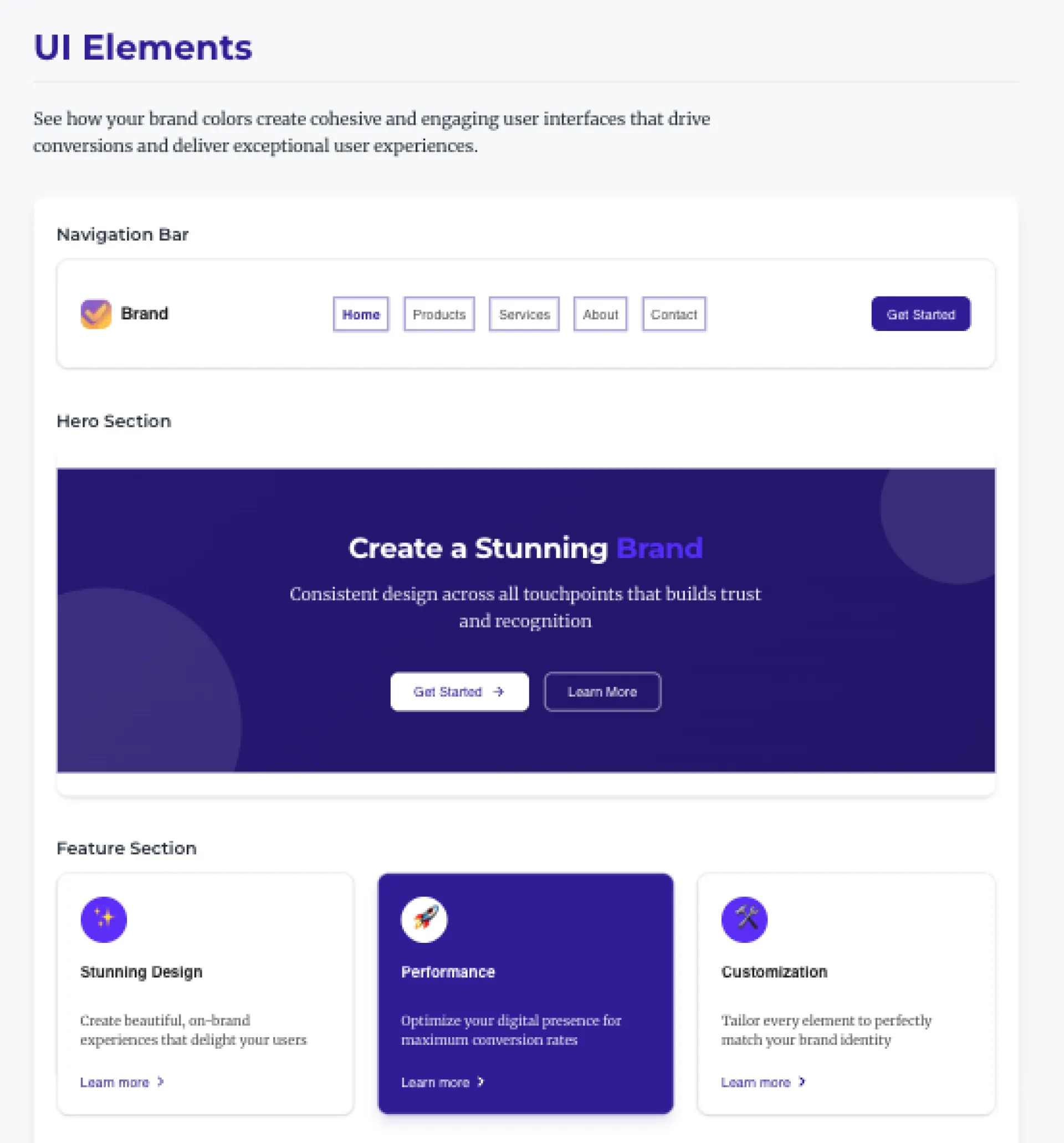
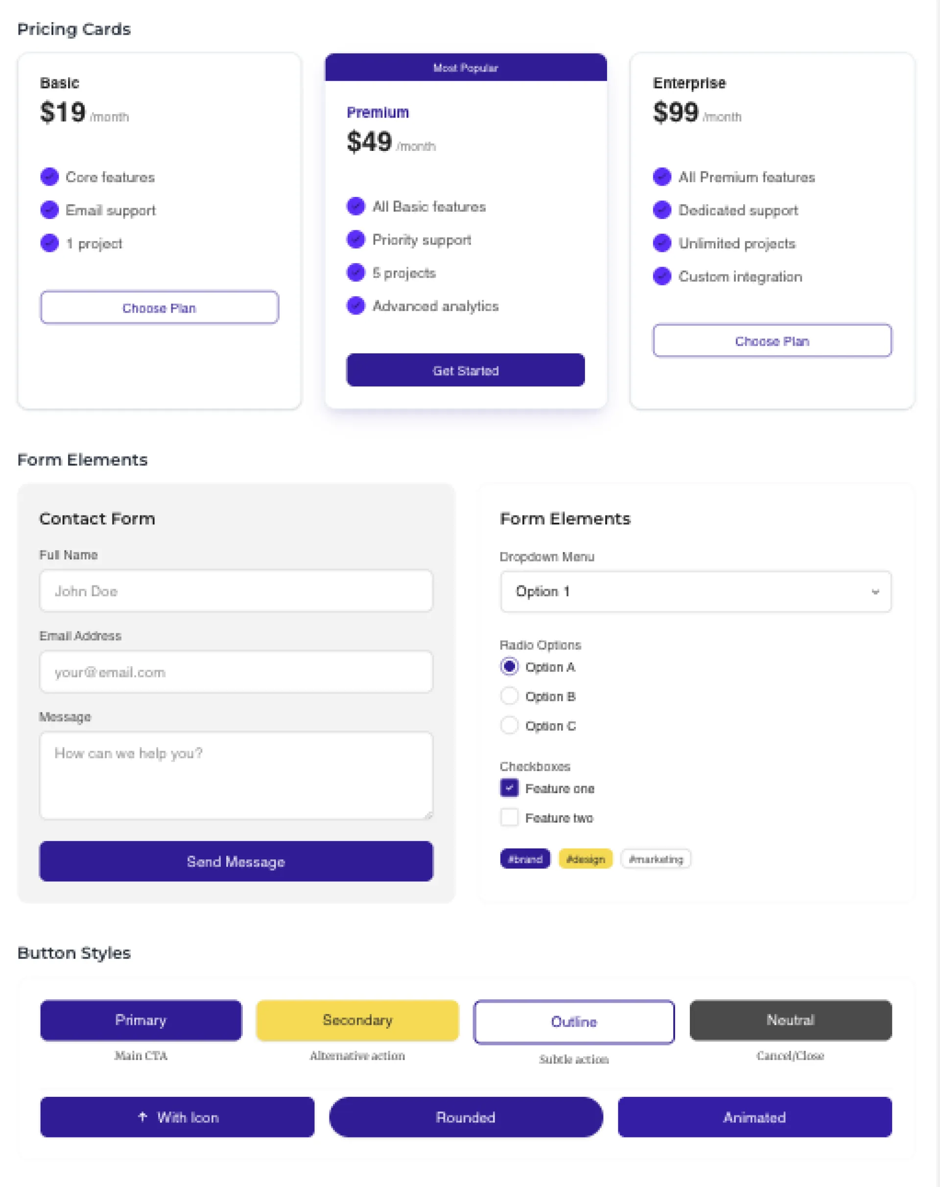
BrandMyApp: My Accidental Solution to the MVP Design Problem
Hey Huzzler friends. So I'm just another dev trying to navigate this crazy internet age. Building MVPs has always been my thing - I love the code, the problem-solving, the functionality of it all. But design? Yeah, I'm absolutely terrible at it.
I'd launch these MVPs that worked great but looked like they were designed in the 90s. Embarrassing, really.
A few months back, I was up way too late (coffee at 10 PM, bad idea) messing around with some AI image APIs. Not for any particular reason - just curious what they could do. I started feeding them design prompts out of frustration with a project I was working on.
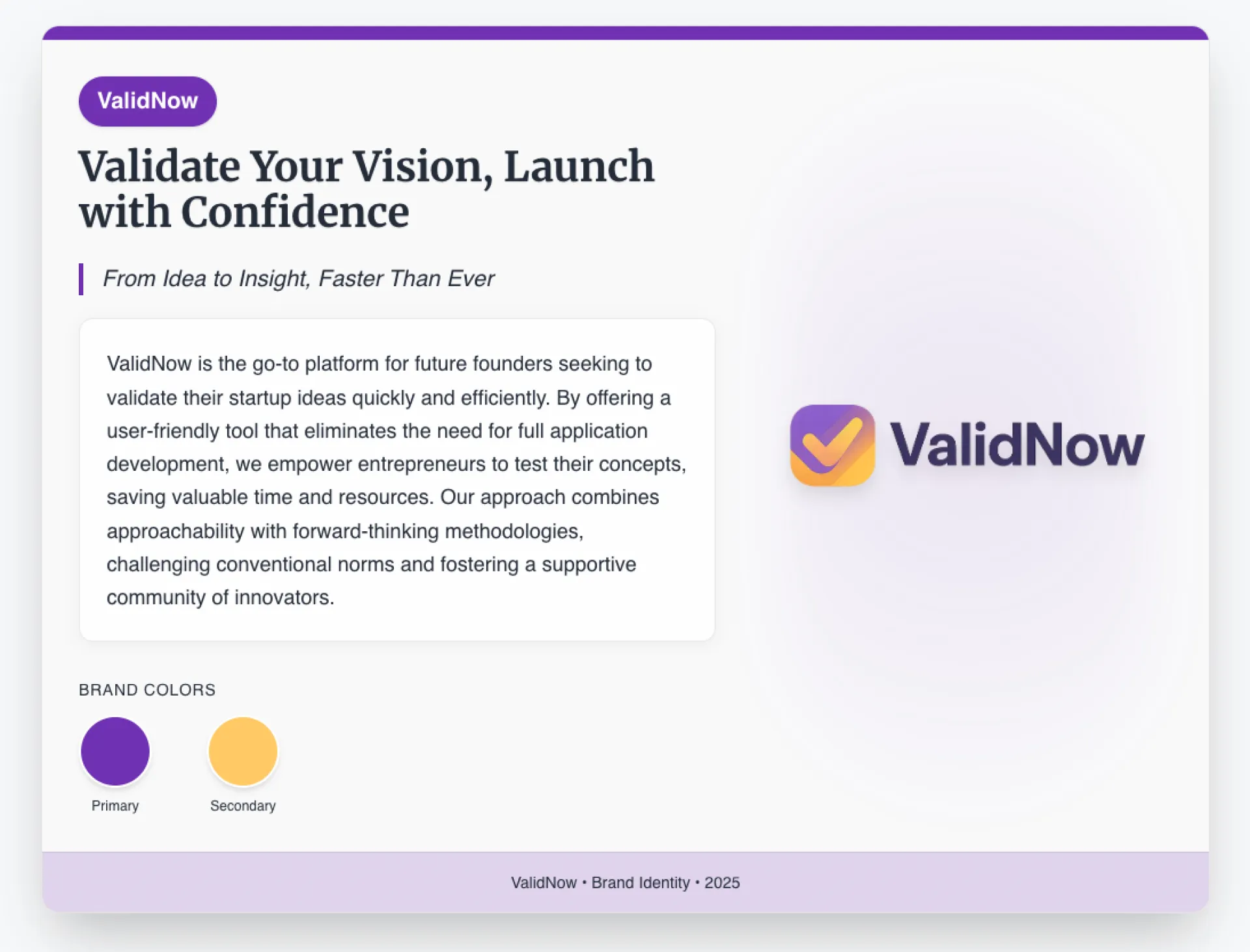
The results weren't perfect, but something clicked. With some tweaking, I realized I could actually generate decent branding elements. Not just logos, but color schemes that made sense together, typography that didn't make my eyes hurt.
So I built a little system for myself. Something to help me quickly brand my own half-baked projects without spending weeks learning design or blowing my budget on freelancers.
After using it for a few personal projects, a friend asked if they could use it too. Then another. That's when it hit me - I wasn't the only one with this problem.
That's how BrandMyApp was born. Not some grand vision, just me scratching my own itch and realizing others had the same itch.
What makes it different from just generating a quick logo is the emotional part. Good branding isn't just pretty colors - it's about making people feel something when they see your product. Trust. Excitement. Curiosity. Whatever fits what you're building.
The process is pretty simple:
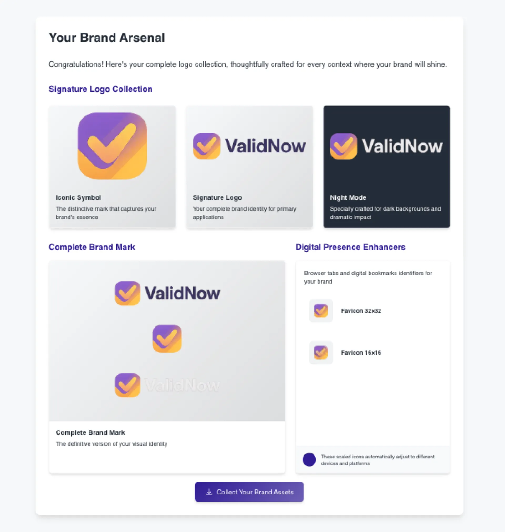
1. You get some logo options that actually work for your industry
2. You see how they look in different contexts (dark mode, tiny favicon, etc.)
3. You get colors that psychologically match what you're trying to communicate
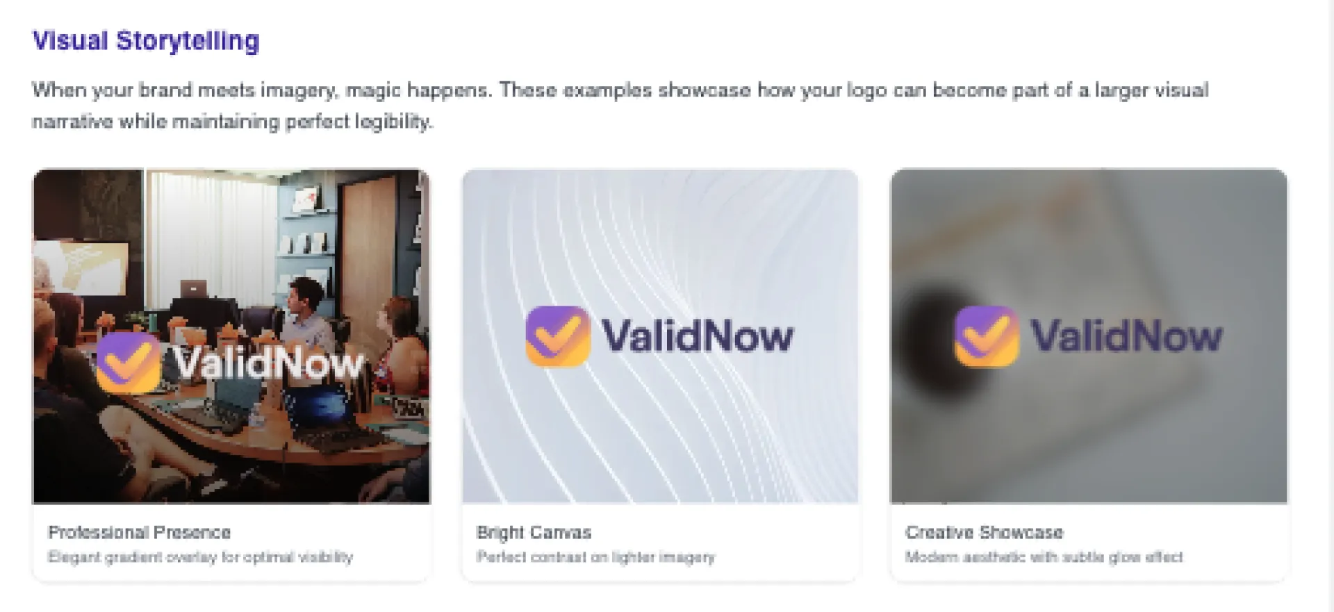
4. You preview everything in actual UI components
5. You get formats that work with the tools indies actually use
The part I'm most proud of is the AI prompts feature. If you use Cursor AI or other coding tools, you get prompts with your brand specs built in. It's just a small thing that saves time, but people seem to really like it.
For bootstrappers like us, I kept it simple:
- One-time cost (starts at $9.99)
- Works even if you can't tell Arial from Helvetica
- Results that don't immediately scream "this is version 0.1"
- Quick, so you can get back to the parts you're actually good at
Anyway, that's my story. If you're like me and design is your kryptonite, maybe give it a try. It's just a tool I wish I'd had years ago.
Any other design-challenged devs here? Would love to hear how you handle the visual side of your MVPs.
If you made it this and read all that - far here is a 25% off coupon for you:
promo_1QU9ySJ6CrinFxkSWrzRCtPf
Making a playlist on the usage of color as an integral component in design.
Just to drill in the importance consider this.
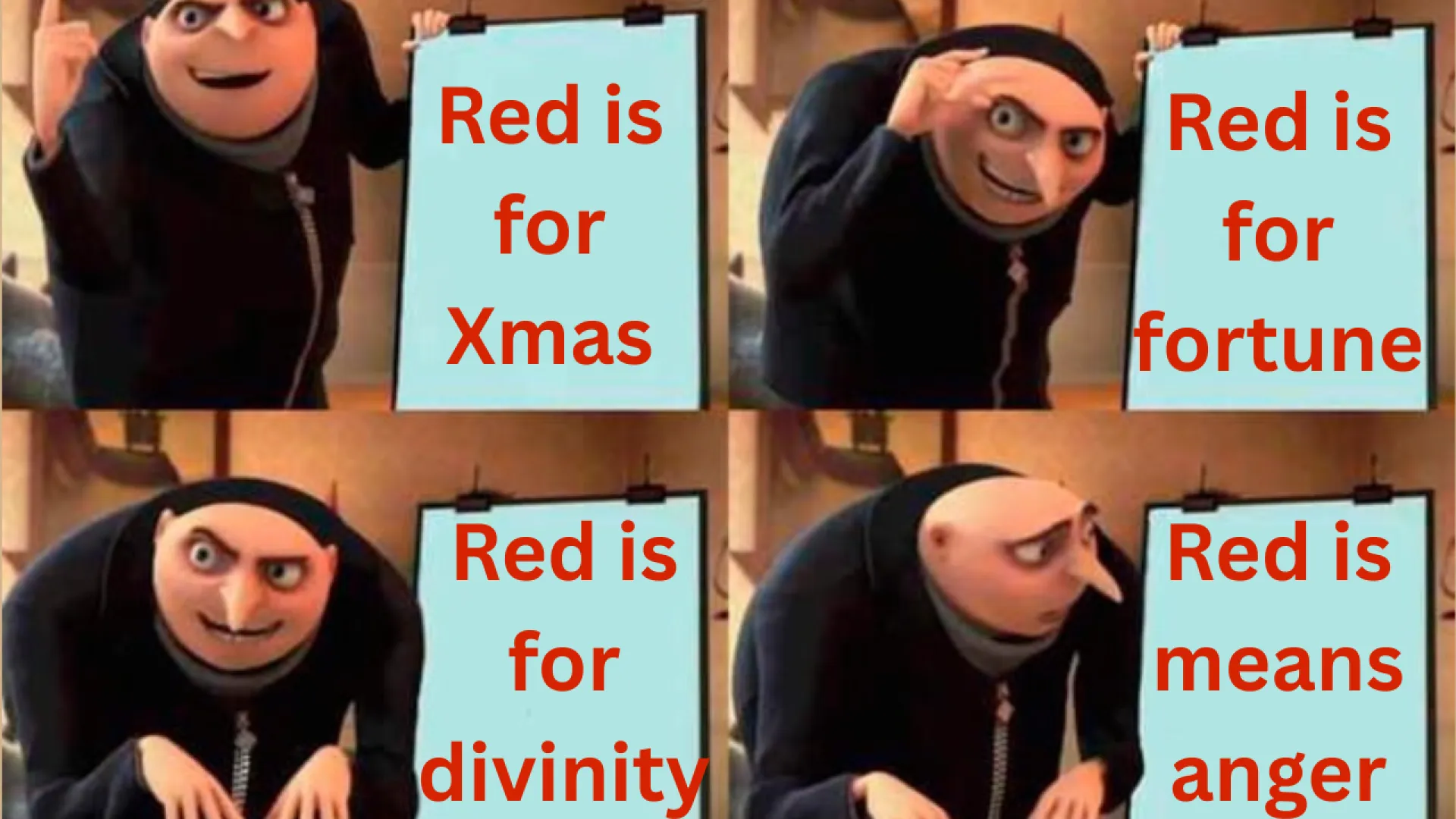
UPS and the Brown Branding Backfire
UPS chose brown in 1916 to convey reliability and hide dirt—earning the nickname "Big Brown" in the U.S.
But abroad, the color clashed with local contexts: in Spain, brown trucks evoked hearses; in Germany, brown uniforms recalled Nazi "Brownshirts."
A reminder that even color can carry unexpected meaning across cultures.
Here's the video where I dive deeper.
Also, here's a more detailed blog post.
I was researching on the meaning of color across cultures, as part of a video I am working on. So, I need a research tool.
Now, I need to create a presentation or a website in minutes.
Can I do that ?
Yes.
There's a 2 step formula that I found:
- Use a Deep Research Tool (Gemini, ChatGPT, etc) -- this is how I conducted my research.
- Use a text to presentation maker, namely Gamma.App.
Here's the final output by gamma. Just crazy.
Here's the YT tutorial: https://youtu.be/Sz2jNt2KHCw
I've used photoshop and Photopea (free web photoshop alternative) casually for the past 10 years but Photopea has recently been buggy for me to use.
Has anyone on here tried affinity photo 2? It's a one-time payment and is supposed to be very comparable with photoshop. I mainly need basic editing features such as layer styles. and be able to open and save images as .psd files.
I also tried Gimp but I really dislike the UI.
So if anyone tried it, feel free to let me know, anything is appreciated! Thanks guys
I'm a good programmer but I suck at design. how are you guys handling the design of your sites or apps? Do you make designs first of every page or just go with the flow? And what tools are you using? I know many people use figma
I'm currently designing a landing page but I'm very bad at design. It feels like I don't know what I am doing. How are you guys handling design? Do you copy existing designs or design everything yourself?
Any libraries or tools I might be able to use? I use next.js
Hey guys. I just added notifications to Huzzler. What do you think about the notification dropdown design? Would you change / improve anything?
Thanks!