CVComp
JD contexed AI CV Scanner & Live Editor
Hey fellow builders,
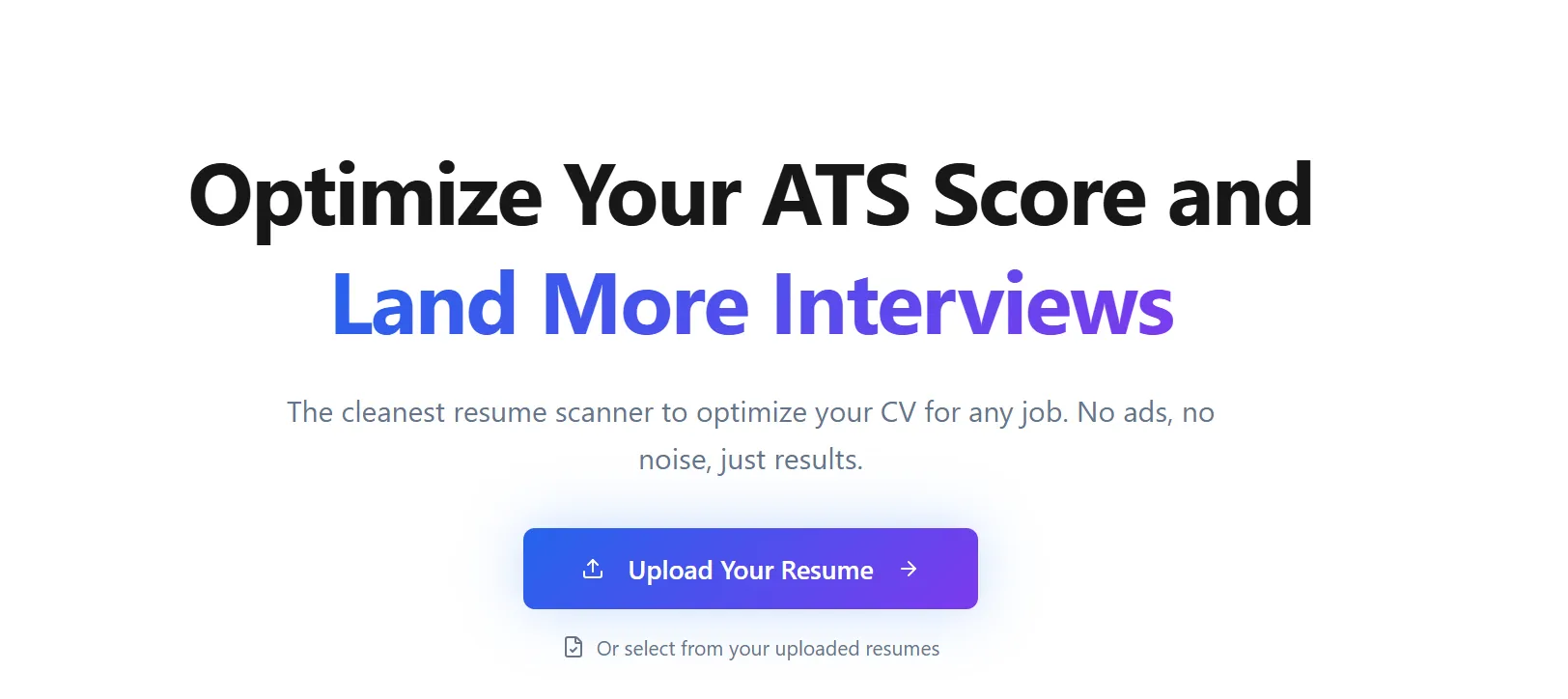
I’m looking for some honest feedback/roasting on the core UX of my project, cvcomp.
The Hypothesis I started building this because I felt that standard resume scanners were optimising for vanity metrics. They give users a "95/100" score based on formatting, even if the content is totally irrelevant to the job they are applying for.
I decided to build a tool that forces Context. It compares the resume strictly against a specific Job Description (JD). If the resume is well-written but misses the specific semantic requirements of the JD, the score drops.
The UX Challenge (Where I need help) The biggest friction point in this space is the "Edit Loop." Usually: User scans resume -> Finds gaps -> Opens Word/Canva -> Edits -> Exports PDF -> Re-uploads.
To fix this, I built a Live Editor directly in the browser. You can click "Accept" on AI suggestions or double-click to manual edit, then download the PDF immediately.
What I’d love feedback on:
The On-boarding: Does the requirement to upload a JD immediately feel like too much friction, or does it make sense given the value prop?
The Live Editor: Does the "Accept/Decline" flow feel intuitive, or does it feel like you lack control?
The Tone: Does the "Gap Analysis" feel helpful, or is it too discouraging compared to standard scanners?
I’m trying to validate if this "tough love" approach is better than the "feel good" approach of competitors.
Here is the link: cvcomp.com
Don't hold back, if the UI is confusing or the logic seems off, I want to hear it.
Thanks,
Prashatha Jain