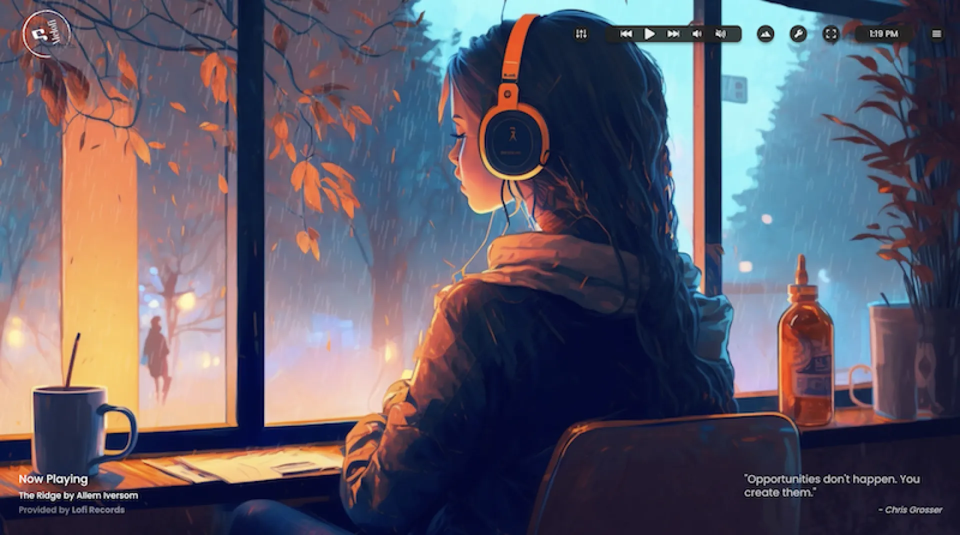
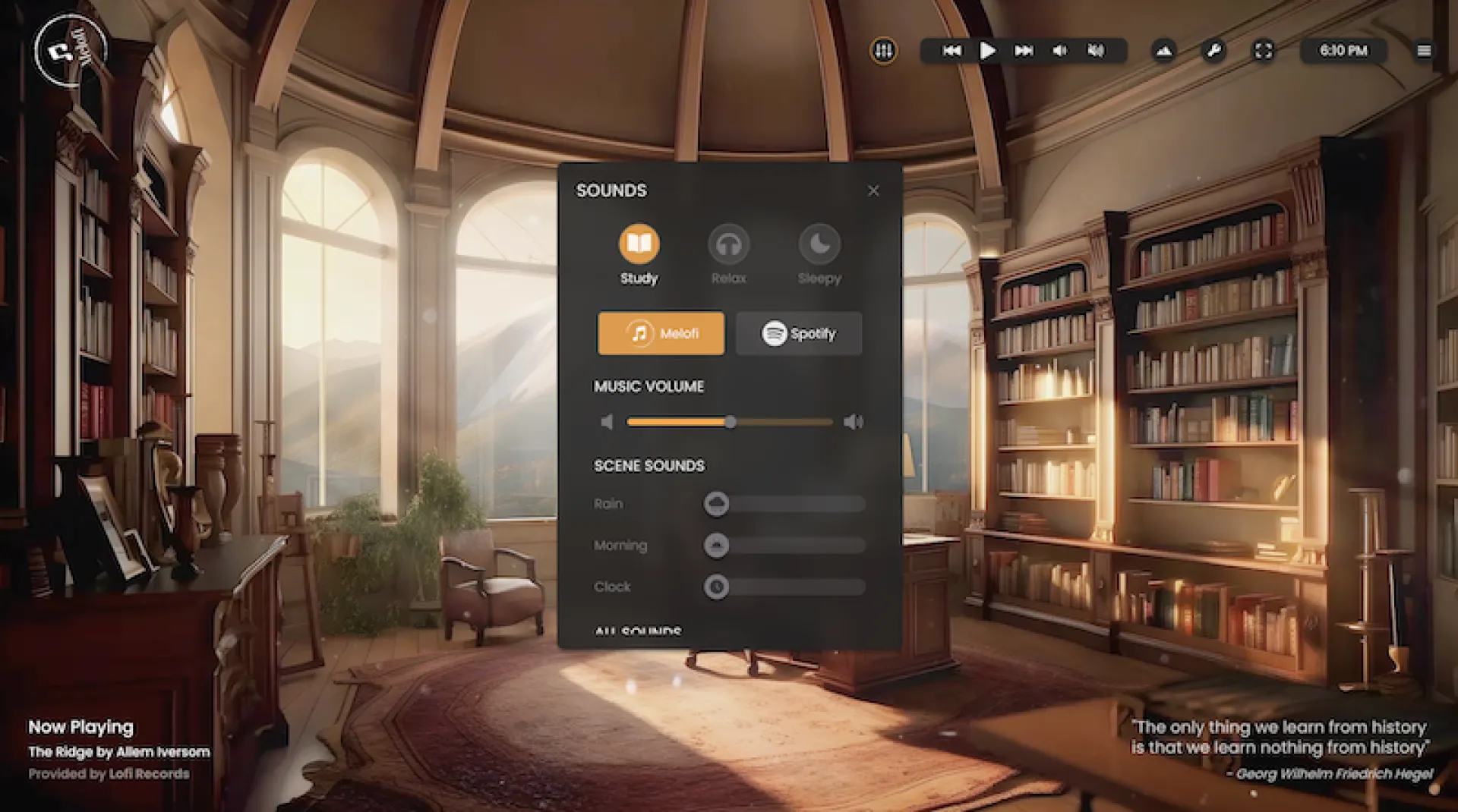
When I first set out to build Melofi, I wanted more than just another lo-fi music app—I wanted to create a full productivity environment that felt beautiful, personal, and effortless. One challenge that immediately stood out was syncing dynamic visual scenes with an evolving sound experience. Getting that harmony between ambient visuals, playlists, and user preferences meant building a mixer that let users control each sound layer—and integrating Spotify so people could pull in their favorite playlists seamlessly. Making this intuitive took some serious design iterations and plenty of UX tweaking.
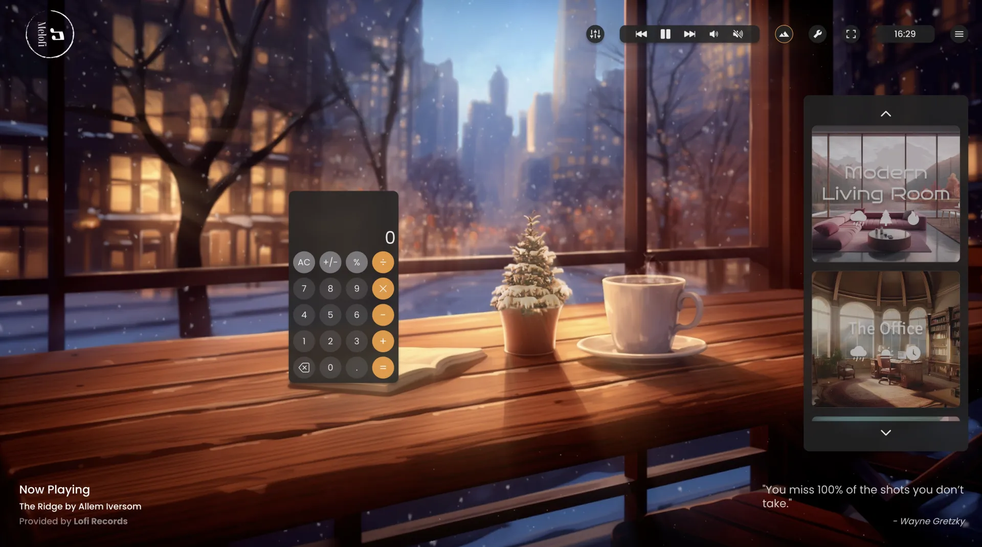
Another major challenge came with offering depth without clutter. Features like the Pomodoro timer, templates to save custom environments, alarms, and detailed focus stats needed to feel like part of a calm, cohesive experience—not just a toolbox of widgets. Building things like the draggable, customizable toolbar and finding elegant ways to encourage users to upgrade (without being annoying) pushed me to think deeply about how functionality and aesthetic can serve each other. I also spent time creating delightful onboarding flows, hover messages, and playful upgrade modals that felt true to Melofi’s vibe. It’s been a creative and technical adventure, and I’m just getting started.
Ready to experience Melofi for yourself?
Start your focus journey today—no noise, just flow.
No comments yet. Be the first to comment!